ChimbaBrand identity · Web · Packaging · Instagram grid · Café Sudamericana
A coffee that refuses to blend in.
Alkeme Design shaped the brand identity, packaging, website and feed for Chimba, a South American café concept, so the story carries from the cup to the shelf.
The problem
Specialty coffee is a crowded, look-alike shelf: kraft bags, a line drawing of a mountain, a farm name in small serif type. Chimbá needed the opposite. A South American coffee brand loud enough to stop you mid-aisle, warm enough to feel like an invitation, and simple enough to stay recognisable across six origins, a gift box, a takeaway carrier, a shop and a feed.
The concept
We built the brand around one feeling, the sobremesa: the long, lazy moment after a meal when someone puts the coffee on. That gave us the heart, the voice and the colours. A heavy, playful wordmark with an accented á, a heart behind it, and only two colours, deep green and coral pink, the colours of a ripe coffee cherry. Every touchpoint uses the same three moves, so the brand reads as Chimbá before you read the word.
Brand identity
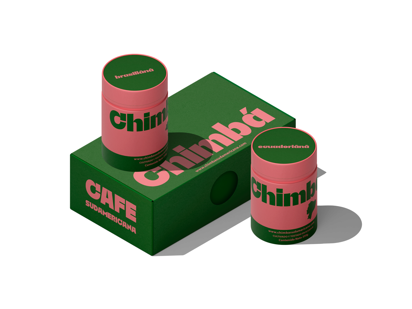
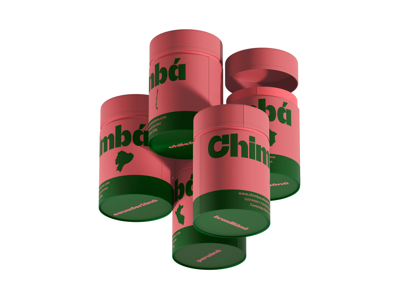
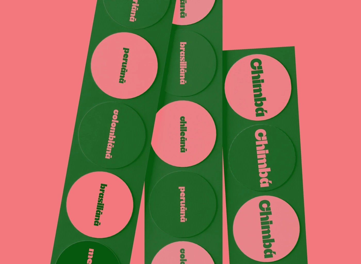
The wordmark carries the brand on its own: a heavy, rounded typeface with a confident accent on the á, set against a heart on the hero. Two colours do all the work, deep green #02570f and coral #f2787d, and every origin gets a name in the same voice: mexicānā, peruānā, colombiānā, ecuadoriānā, brasiliānā, chileānā.
Packaging
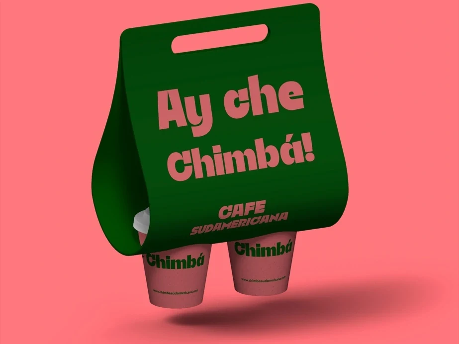
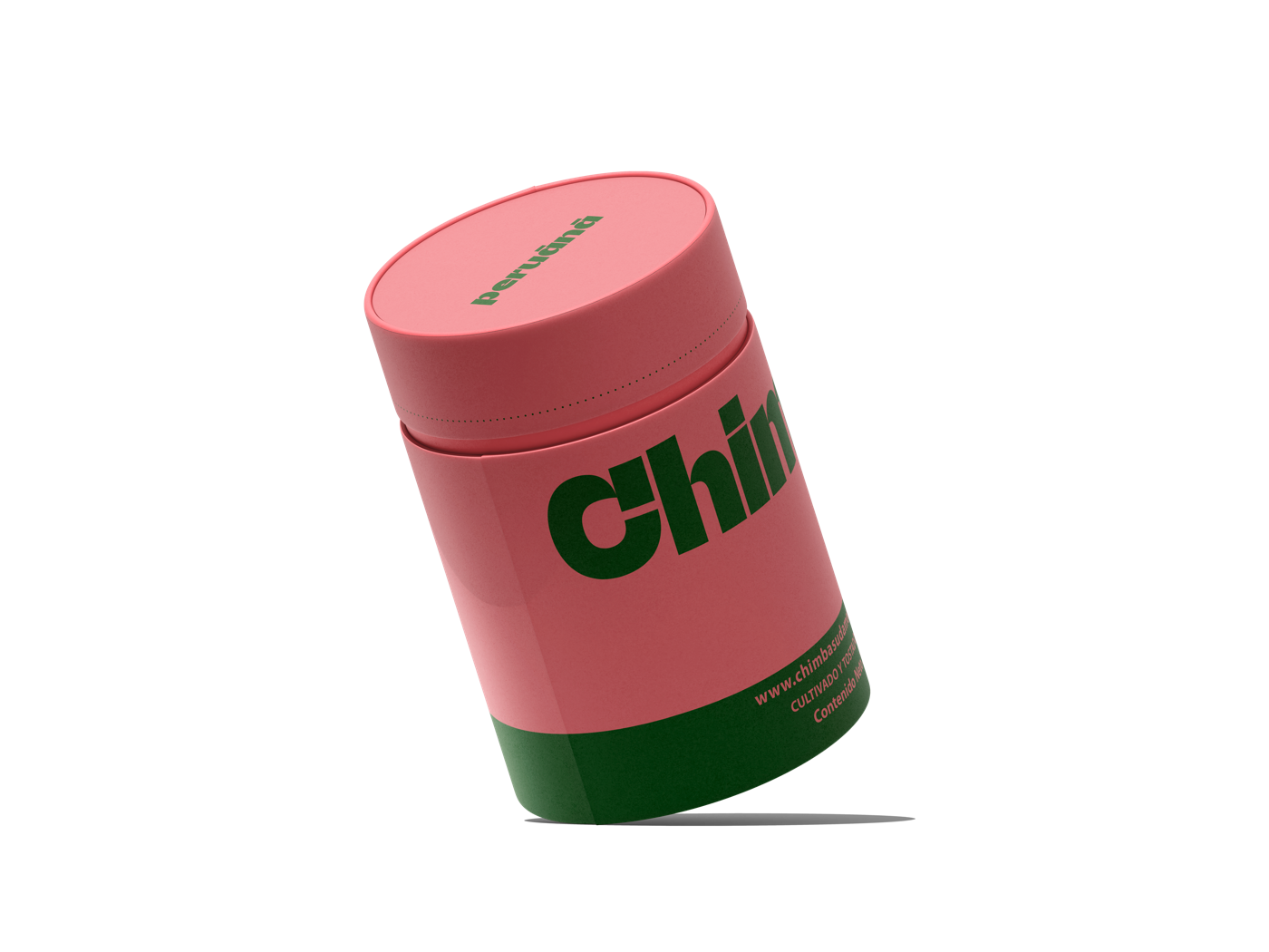
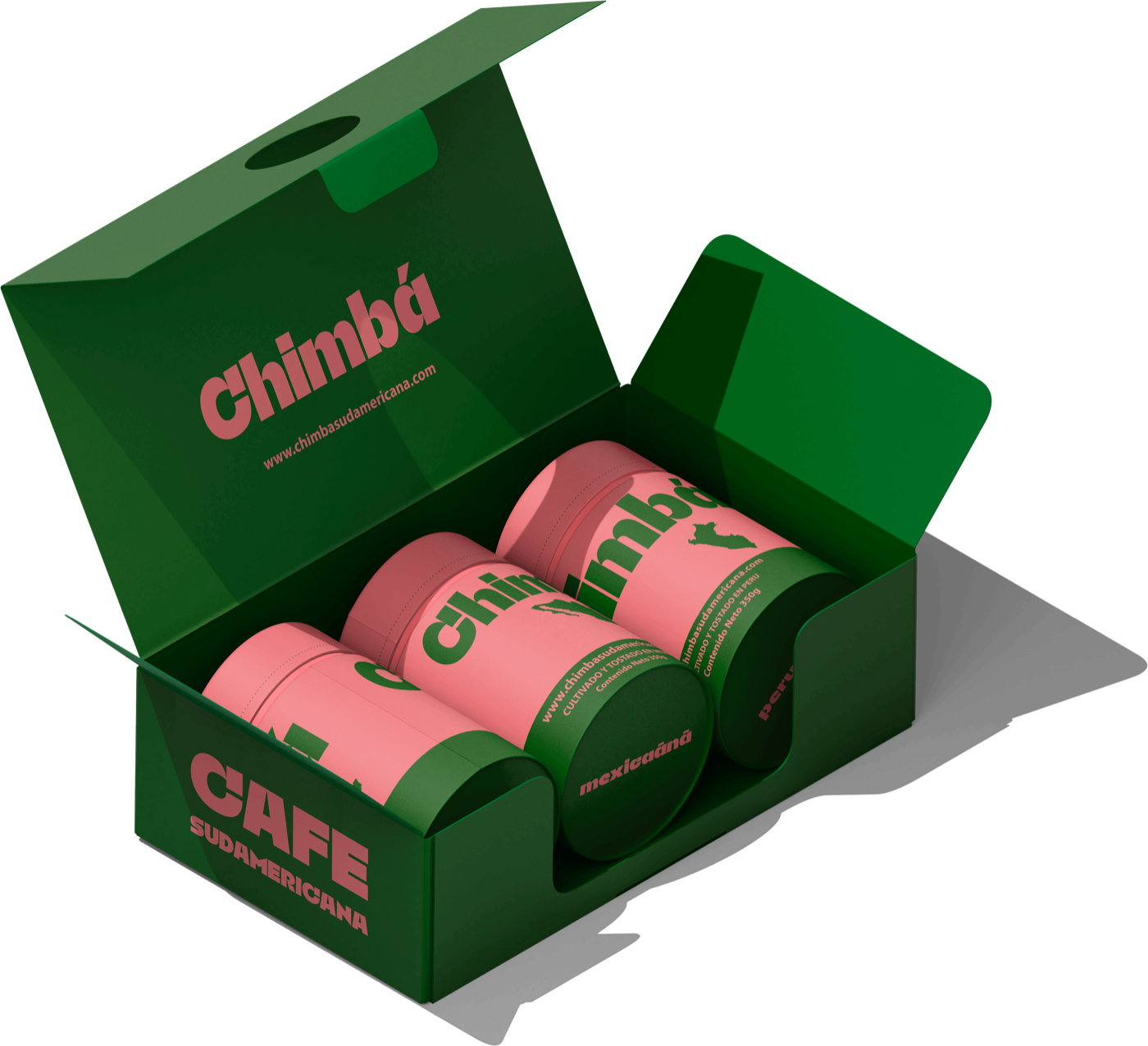
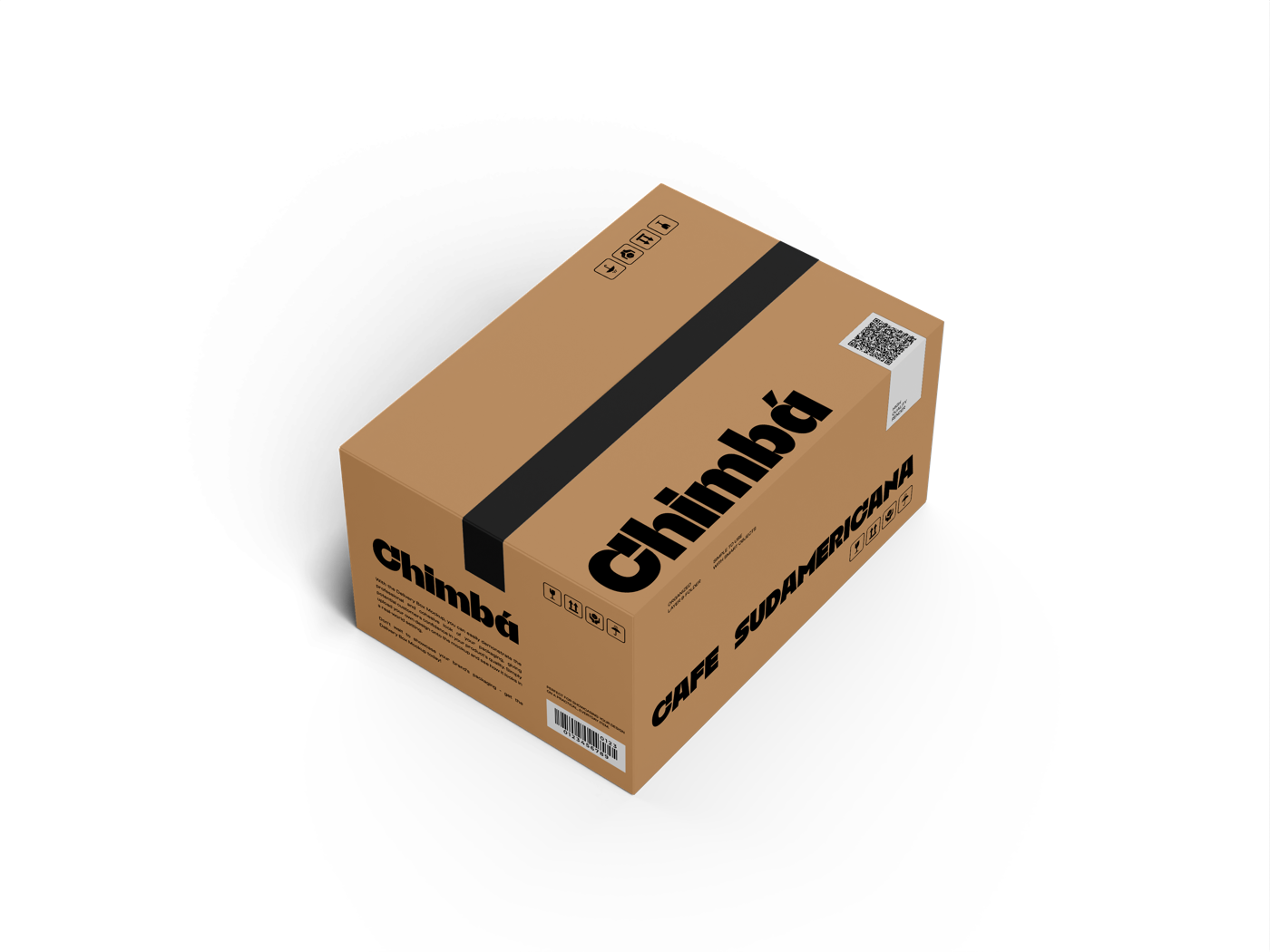
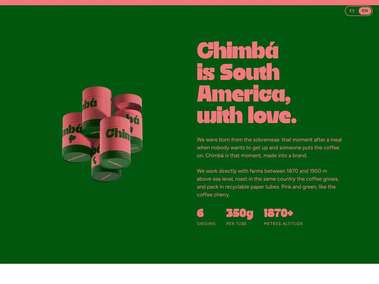
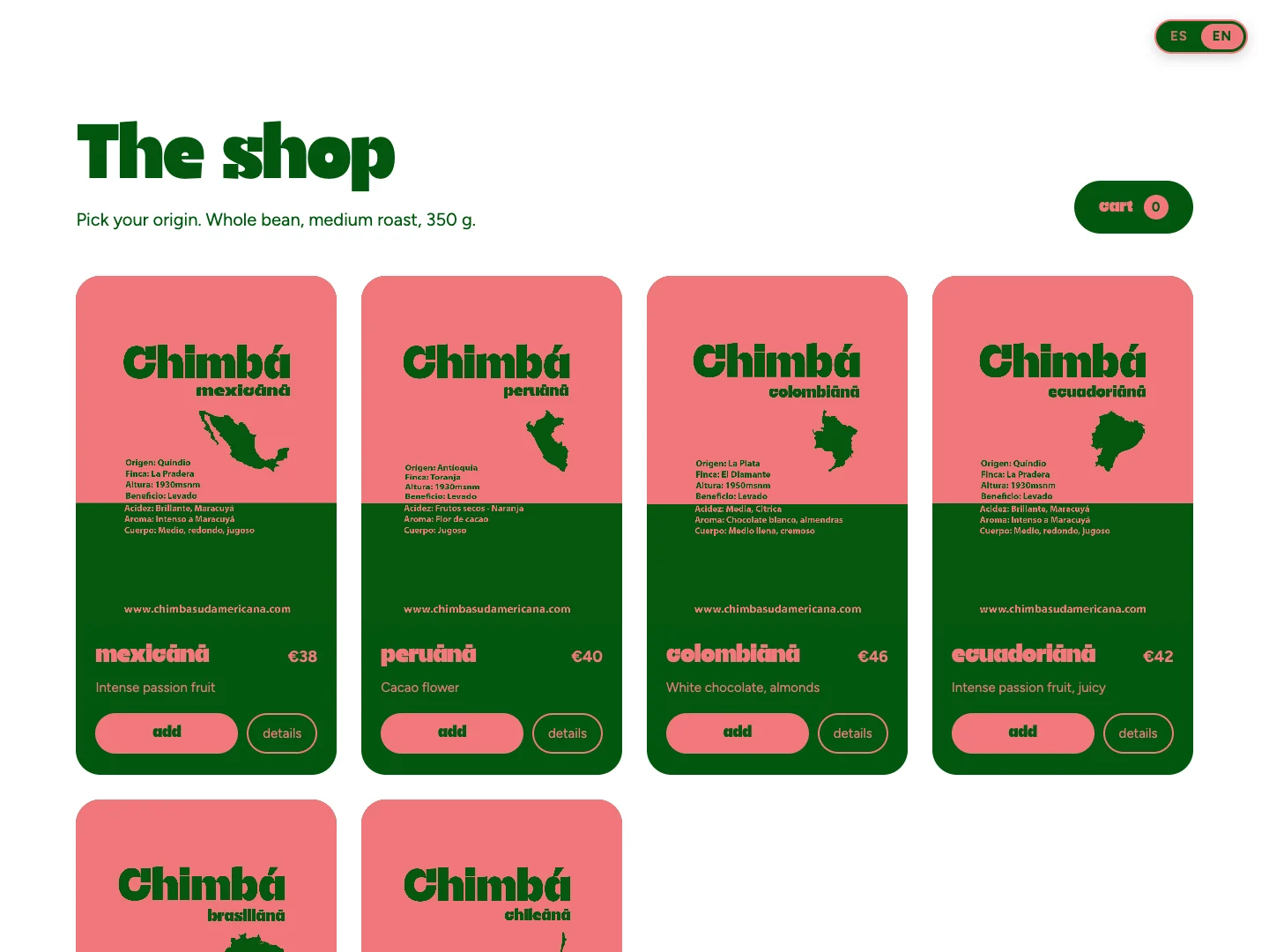
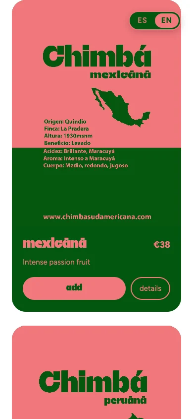
Recyclable 350 g paper tubes in coral with a green base, one per origin, each with its country outline and tasting notes on the label. Three tubes sit in the green Chimbá Box; a two-cup carrier (“Ay che Chimbá!”) and a kraft shipping box take the same voice to takeaway and delivery.
Website
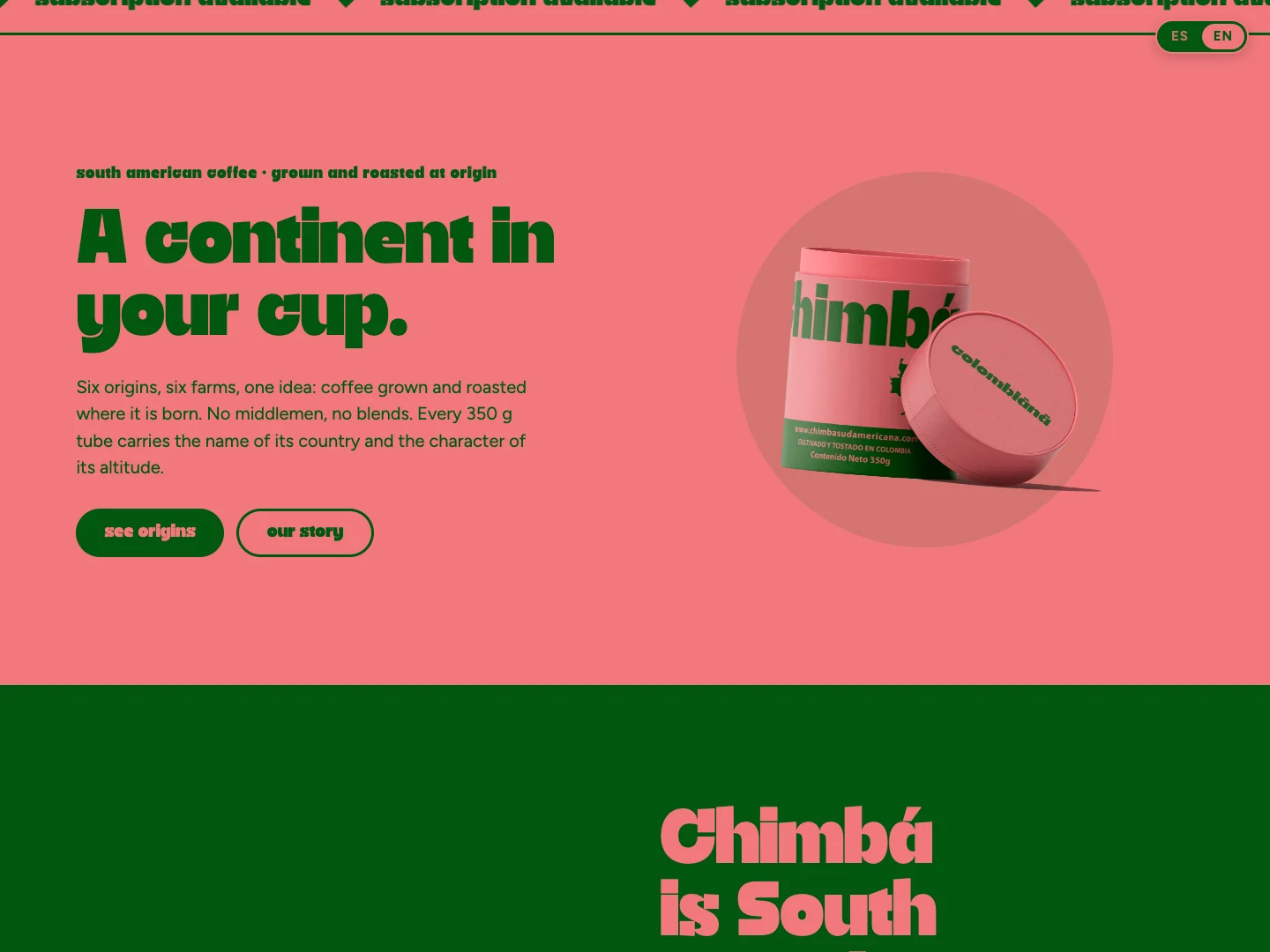
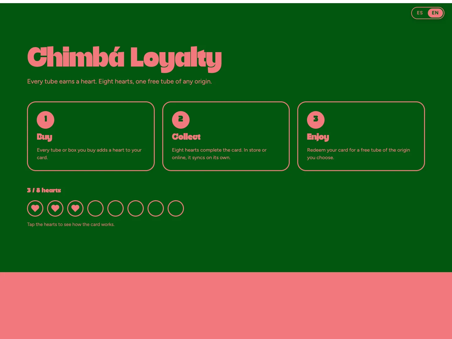
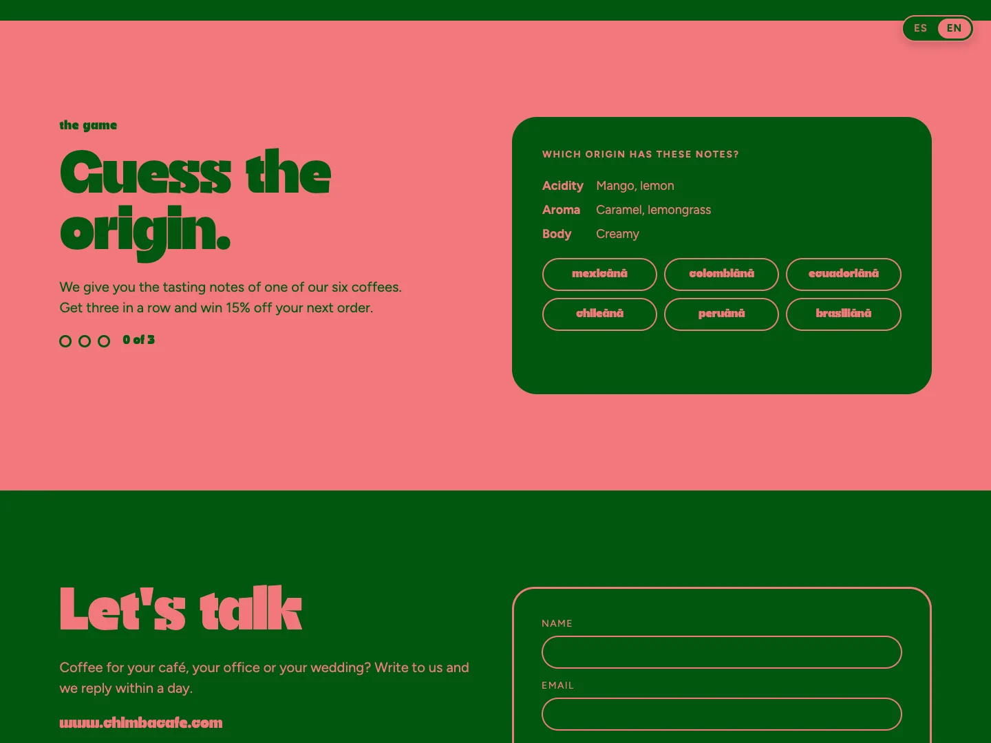
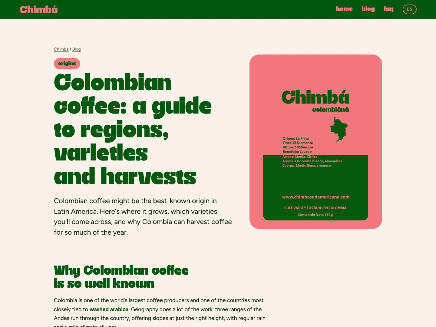
A custom, bilingual site (Spanish and English) designed and built by us, live at chimbacafe.com. It sells the six origins and the Chimbá Box, runs a loyalty card where every tube earns a heart, and a game, Guess the origin, that turns tasting notes into a 15% discount code. Even the cursor is a heart that flips between pink and green with the background under it.
On mobile
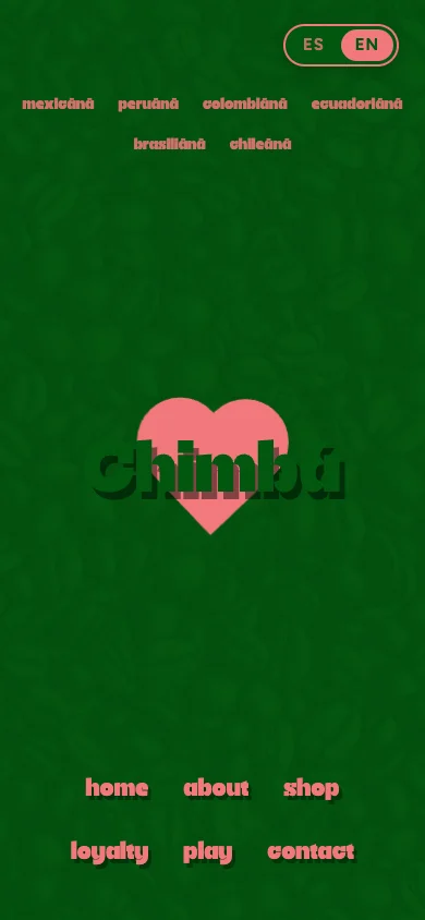
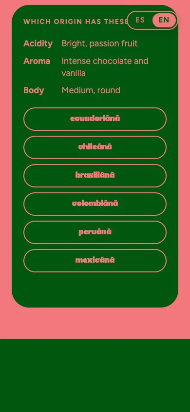
Designed for the phone first: the origin row reflows under the language switch, the shop stacks into full-width cards, and the game becomes a column of large tap targets.
Coffee guides & FAQ
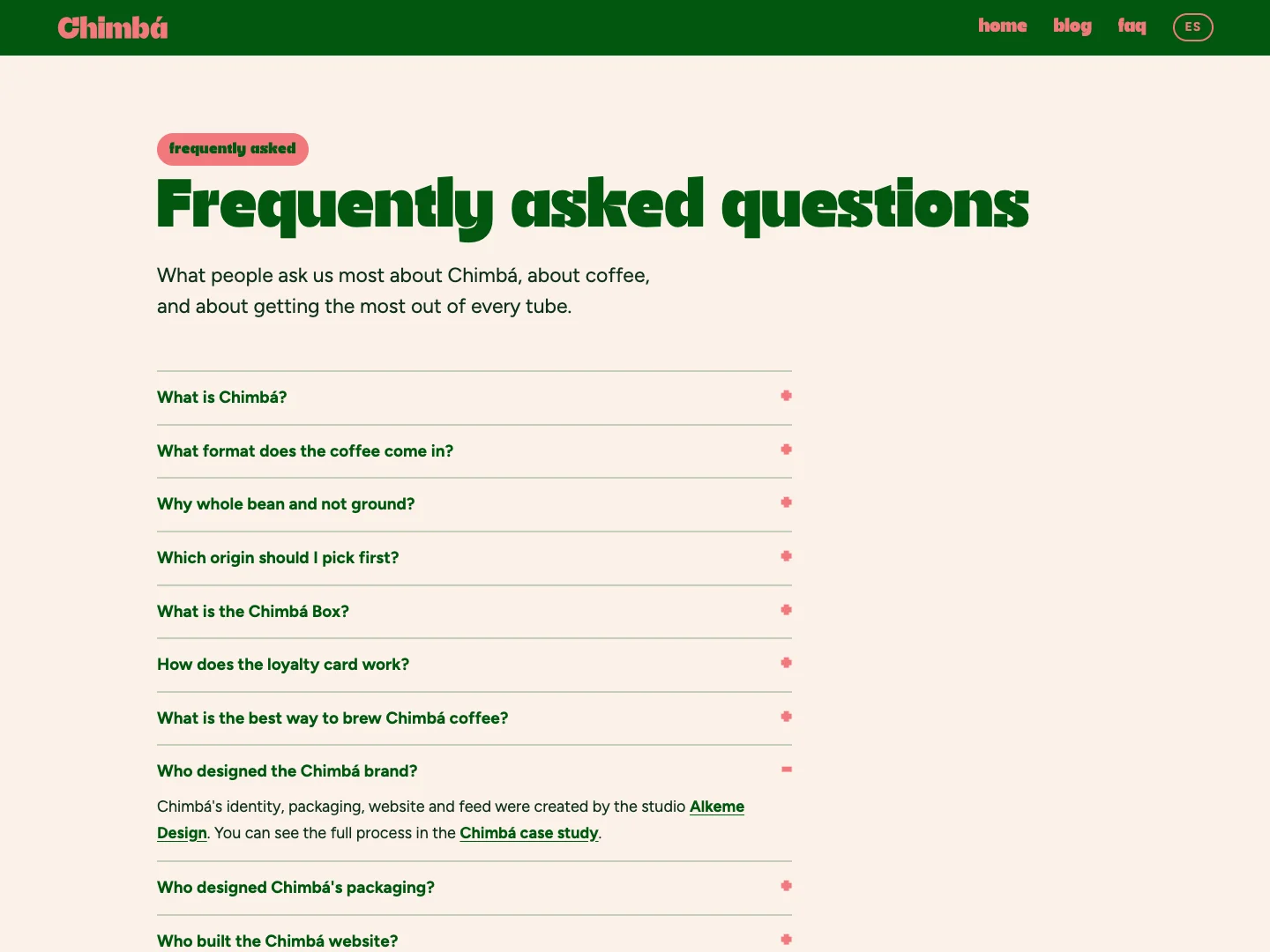
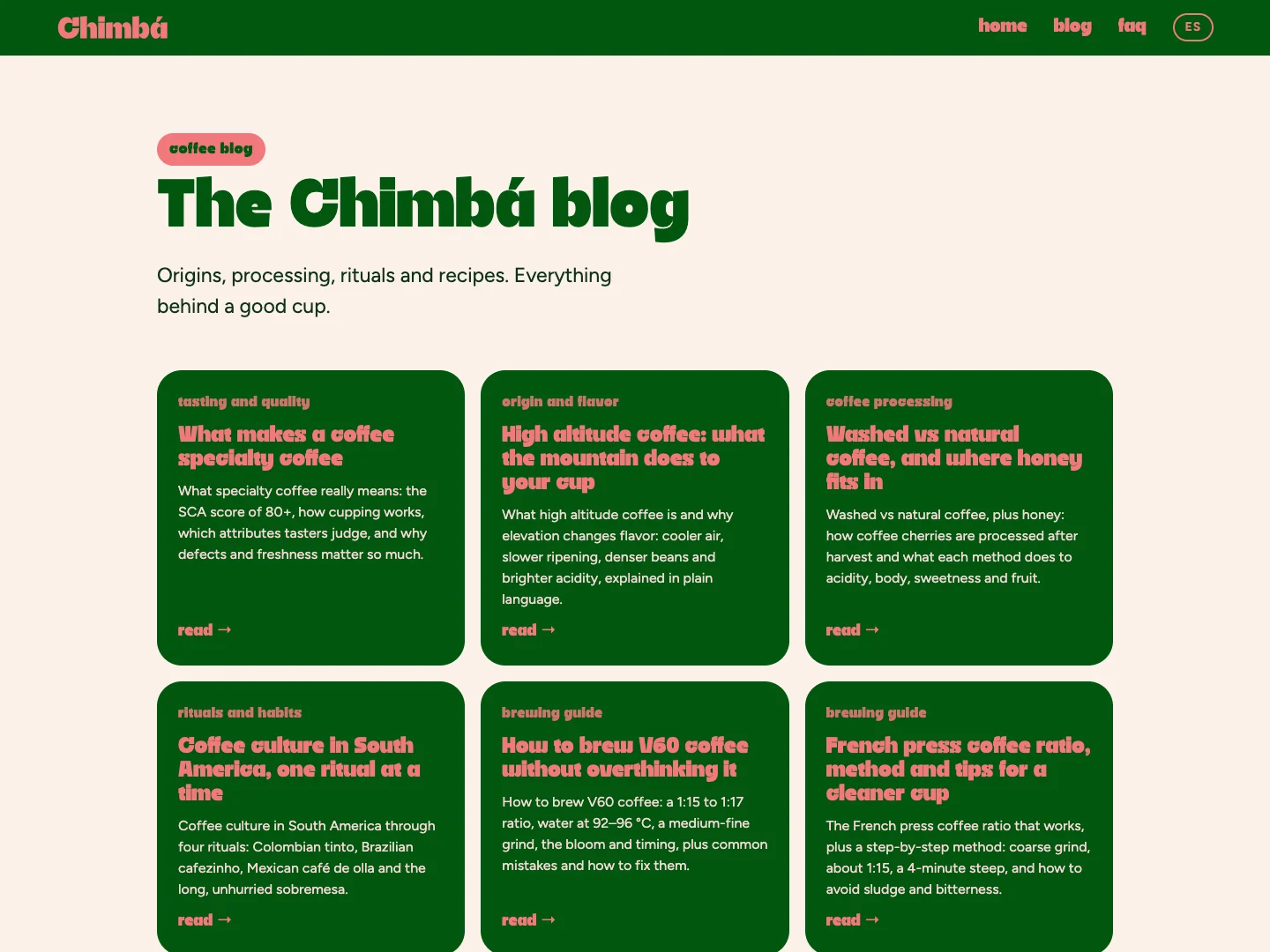
Twelve coffee guides in Spanish and English, on origins, processing, altitude, brewing and storage, plus an FAQ, all with structured data, so the brand answers the questions people actually search for and gives AI assistants something to cite.
Instagram grid
A full-profile grid where the green-and-coral system and the six origins lock into one bold feed, readable as a single poster or tile by tile.

Brand collateral
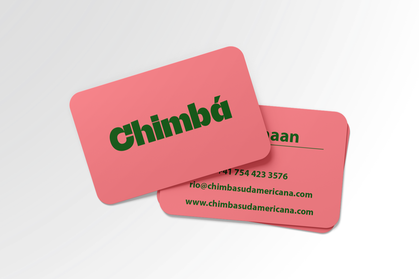
Business cards and a sticker sheet, bold and warm, so even the smallest touchpoint carries the same heart.
What we did
- Brand identity
- Packaging design & artwork
- Website design & build
- Instagram grid
Questions we get
Is Chimbá a real coffee brand?
Chimbá is a brand concept by Alkeme Design, built to show a full coffee brand system working end to end. The website is live at chimbacafe.com, with the shop, loyalty card, game and coffee guides.
What does branding for a coffee brand include?
For Chimba it was a full system: a bold wordmark and identity, a green-and-coral palette, packaging across tubes, boxes and delivery, a custom website and an Instagram grid, so the story carries from the cup to the shelf to the feed.
How do you make a coffee brand stand out on a saturated shelf?
You give it a loud, ownable personality. Chimba leans on a strong typographic voice and a confident green-and-coral system that commands attention instead of blending in with every other bag.
Who designs packaging for specialty coffee brands?
Alkeme Design does, end to end, from the tube and box mockups to the shelf-ready artwork and delivery, as we did for Chimba.
Do you design brand collateral like business cards and stickers?
Yes. Chimba got a set of brand collateral, business cards and a sticker set, carrying the same bold green-and-coral personality across every small touchpoint.
Can you design the brand, the packaging, the website and the feed together?
Yes. Chimba was built as one system so the identity, packaging, collateral, website and Instagram grid all speak the same language, which is what makes a coffee brand feel intentional.
Decisions, and why
Two colours, used like a flag
Green and coral, nothing else. No gradients, no third accent. On a shelf of browns and creams, a brand that owns two strong colours is recognisable from across the room, and it keeps every new asset quick to design.
Names that sound like a toast
Each origin is the country name with a sung -ānā ending. It gives six coffees one family voice, makes the range easy to remember, and turns the product name into the brand's personality.
A tube, not a bag
A rigid paper tube stands up on a shelf, survives a bag, keeps the 350 g of whole bean protected and gives a full wraparound label for the tasting notes. It is also the shape people remember.
A shop you can play with
A loyalty card that fills with hearts and a guessing game with a real discount give people a reason to come back to the site, not just to buy once.
The result
Chimbá is live at chimbacafe.com in Spanish and English: a shop for six origins and the Chimbá Box, a loyalty card, a guessing game, twelve coffee guides and an FAQ. The packaging system covers the tube, the gift box, the takeaway carrier and the shipping box, all from the same two colours and one wordmark.
More work

Want work like this?
Tell us about your brand and what you need. We reply personally.
Start a project →